Community Translate Refresh
The Task
- Update the Translation Dashboard, a main point of entry for new community translators.
The Goal
- Introduce new users to the platform’s translation interface.
- Route users to the detailed translator guidelines.
- Encourage them to contribute to content translations.
The Challenge
- Restructure the content hierarchy in a logical and intuitive way for new users.
- Guide the user journey along a specific path.
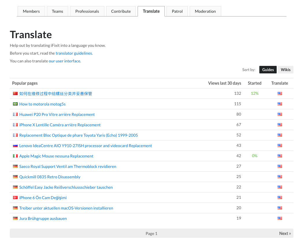
Before
This was the pre-existing dashboard on the site. It hadn’t been updated since its creation in 2016.
Challenges
The primary challenge this task had was restructuring the page content to have logical and intuitive hierarchy.
The main actions we wanted users to take (in this order) were to read the translator guidelines and start translating either the user interface or site content.
Since the requirement to include a link to translate the user interface on an external website was such a small visual element compared to its hierarchical equal (the giant table of guides), finding an intuitive layout took a few attempts.
First Iteration
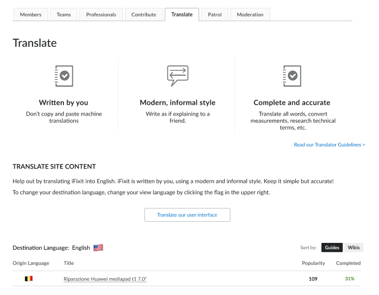
Things I was unhappy about:
- The lack of bounding structure around the icon tiles made it not as visually enticing as I wanted it to be.
- Including the Translator Guidelines link didn’t look quite right no matter where I aligned it.
- The “Translate our user interface” button drew too much attention to itself and made for awkward whitespace on the sides. It didn’t seem to visually belong anywhere.